"How can I make things look appealing/eye-catching by using colors, stylistic choices, and/or my own characters?"

"This is my original character, Jay, but she’s dressed as (?) a zombie for Halloween. For something Halloween themed, it’s pretty common to see people use dark colors, but I decided to do something bright (as always) because I felt like it would stand out more and I felt better doing it that way anyway. When I was drawing this, I really wanted to draw a pose that didn’t look super two-dimensional, since I had some cool ideas in my head for what I could do with that. In the end, I feel like I succeeded because of the arms and the hand. The background was an afterthought because when I had the idea for this drawing, I only thought of the posing and coloring and not the background at all. I like the white outline I did because it creates a lot of contrast between the character and the background."

"Blue (yeah he’s pretty blue, I know) is a character that I very recently redesigned, so before I drew this, I was basically banging my head against a table (not really) trying to stop overthinking his design. Blue has actually been through, like, 4 or 5 design changes? So I’m pretty happy to finally have him at a place that I think not only makes him look stylistically cool, but also finished. Of course, you can’t see his whole design in this drawing, but I assure you it’s done. Now, looking at the drawing itself, I’m pretty happy with the final product and I feel like I did him justice. I intentionally made his colors not have a lot of different values because I think it goes with his characteristics. The shading that I did here isn’t anything that I’m super proud of, since I think it might be a little confusing when looking at his sleeves, and I didn’t do the fancy effect I usually do because I didn’t think it looked good in his hair. I’m pretty happy that I managed to make everything look pretty bright despite his color scheme."

"I learned that I have a lot more fun drawing expressions than I thought I had. I also learned that using more saturated color choices for this one really helps it look visually appealing. Overall, I just wanted to draw some character interaction between the two most developed characters I have."

"Everything here was kind of an afterthought for me; I didn’t plan out a background, I didn’t draft her colors beforehand or anything, I just wanted to get her drawn onto something ““finished,”” which made me really frustrated when I was drawing this because I didn’t really know what I was doing with it at all. I wish that I came up with a more creative background, but it was taking WAY too much time to figure out. Also, I was struggling with my program because it kept glitching or being incredibly exasperating to work with, so I’ll be moving programs to get a better experience and not be as frustrated as I was."

"The character here is actually my brother’s character, Rose, that I drew for him. Since the character is typically used by him to convey complex emotions, I tried to do something along those lines as well, but I’m not sure it looks that deep or anything. The hand is actually what I’m most proud of here, since I struggle with them a lot and I feel like this one came out pretty much exactly how I wanted it to. The picture in the background is by OPRFHS, and I guess I thought that it fit this drawing because it fills the space how I wanted it to (there’s not really a meaning for that specific image)."

"I drew my character Jay because I wanted to show off her small redesign (the horns) and I had a cool idea. However, the idea ended up not working out: it involved fire in the foreground and background drawn in a 3D sort of way (it’s hard to explain), but after hours of trying to make it look right, I couldn’t draw the fire in the way I wanted it to look, so I used another background idea that I think worked out pretty well. Her clothes are colored to go with what I had planned, but even though it didn’t work out, I didn’t change the colors because I thought they worked well with each other. Of course, I used pretty bright and saturated colors for almost everything here, as usual, since I feel like it makes it brighter and more eye-catching as opposed to using pastels or something (there are SO MANY PEOPLE that use pastels)."
|
|
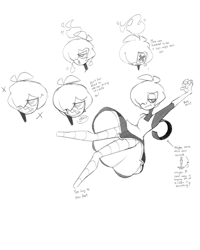
"These are two sketch sheets of a character that I’ve been redesigning. I’m not entirely sure of her name, but she’s going to be a shapeshifter, which opens a lot of options to make finished drawings look interesting. I need to go back and draw some instances of her using her powers, since she doesn’t look all that special here. Anyway, I designed her to look like a handheld candle on a dish (? I don’t know what to call it), hence the dress and how her hair is really rounded out. The thing on her back is supposed to represent the handle that you grab the candle by, but I might just make that part of her design into a ribbon or something to make it less random."

"I was really into making this when I was drawing it because it was one good thing happening after another; the pose is good for my standards, the character design is interesting, the lines are good. When I got to the colors, however, I kind of stopped dead in my tracks and had no idea how to make her look dead but also colorful. I basically just made her desaturated and said “whatever,” but looking back on it, I wish I would’ve changed the background to be brighter and I wish I upped the saturation of her colors so the shading would look more vibrant as well instead of looking like I just lowered the base color’s brightness (boring)"

"This is a sheet of a bunch of sketches of the best characters in Mario Kart Wii, which also happen to be my favorite characters coincidentally. I’ve drawn Daisy in the past once or twice, but I wanted to draw her again to suit her complex hair design to my style, since I find it to be really appealing. Also, Funky Kong is one of those characters that I’ve always loved but never thought of drawing because of the learning curve, but after I finally got his face shape down, all I had to do was figure out his anatomy and then that’s it. The reason I decided to do a sketch sheet instead of working on something bigger is because I haven’t drawn them comfortably before and I wanted to do something a little more “casual” so I could draw without feeling like everything had to be perfect, and also so I could study how they work, I guess."

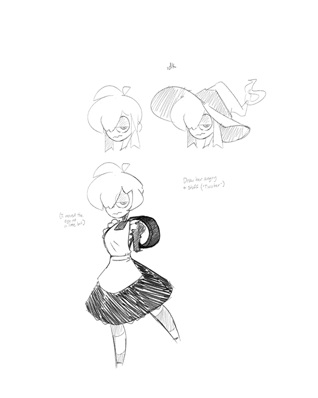
"mute"
"The character that I drew here is fairly new to me (I made her recently) and I based her design off of a handheld candle. The point here is that she’s mute, so there’s a lot of things that she would say, but she comes off as mysterious because of it. I really wanted to make her expression seem kind of sad/remorseful even though I didn’t draw a mouth for her to express with (she has a mouth when I draw her but I felt like it looked right like this). This seems like something that I should’ve used darker colors for, but I feel like the brighter colors make it look more graphic and eye-catching in a way that still conveys the mood but looks cool too."
